How to design a landing page that converts?

August 10, 2025
SEO TIPS
Design Tips
The question every designer and founder thinks about! And trust me - everyone is still seeking the answer. Because your landing page is your digital salesperson.
Whether you’re launching a new product, running ads, or building your email list, a high-converting landing page can make or break your marketing efforts.
At Avyaan Design Lab, we help brands craft landing pages that not only look great but also drive real results. And after seeing proven outcomes for our clients, here are some tips that helped us achieve high conversions.
What is a landing page?
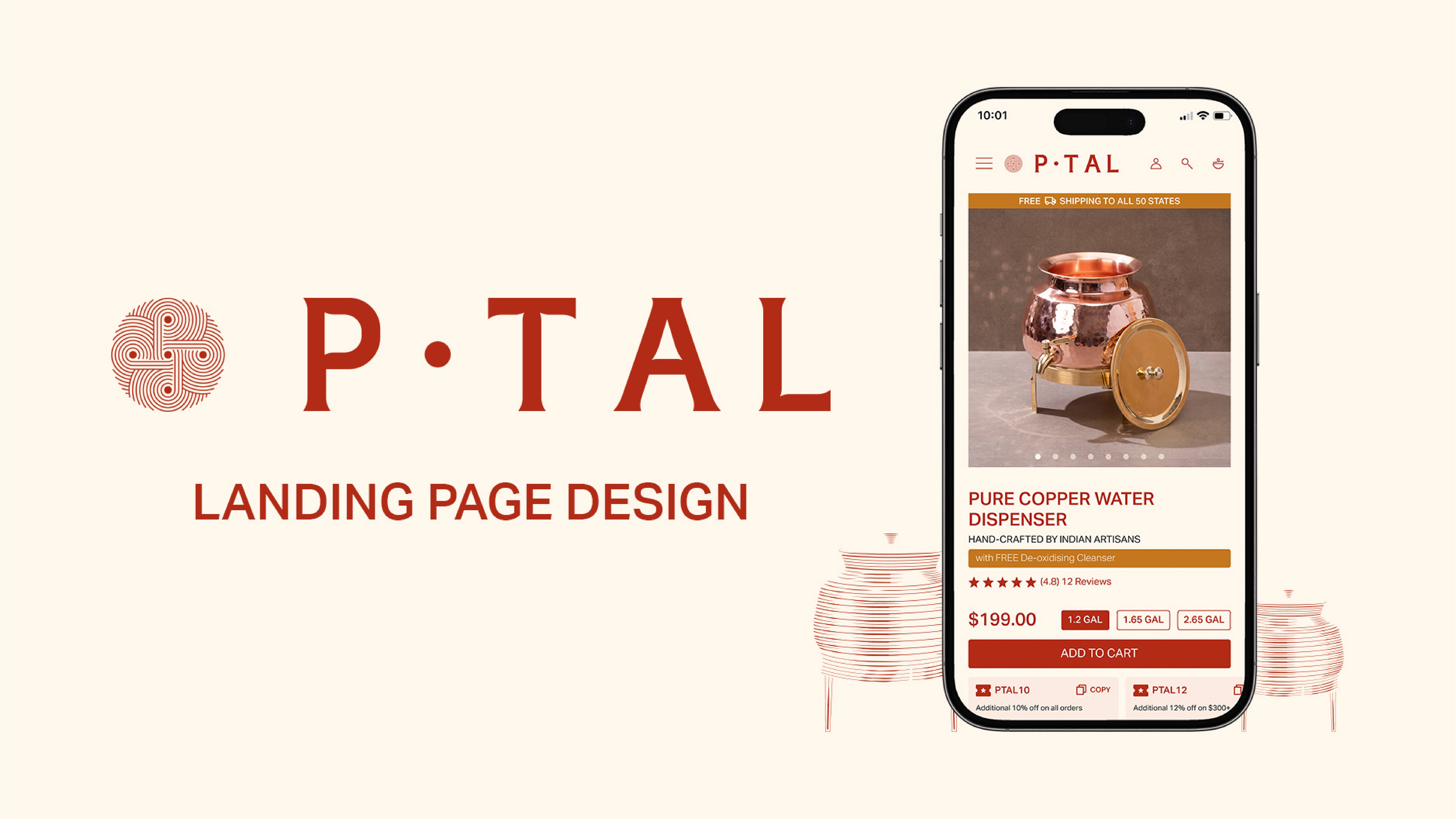
A landing page is a standalone web page built for a specific goal - usually to convert visitors into leads, customers, or subscribers. Unlike full websites, landing pages remove distractions and focus on one action: buy, book, sign up, or learn more.
2. Why most landing pages don’t convert?
Many brands create landing pages that are visually appealing but fail to convert. Why? Because they:
Talk about themselves too much
Don’t address the user’s pain points
Lack a clear CTA
Load slowly or look bad on mobile
Let’s fix that.
3. Key elements of a high-converting landing page
Clear headline that solves a problem
Use the top of the page to answer: “What is this and why should I care?”✅ Tip: Speak directly to the user’s pain point or desire.
Visual hierarchy that guides the eye
Design isn’t just about aesthetics - it’s about directing attention. Use whitespace, bold CTAs, and contrasting colors to guide visitors exactly where you want them to go.One primary CTA (Call to Action)
Don’t confuse your users with multiple options. One page = one goal = one primary button.
✅ Examples: Book a Call, Try for Free, Get the Sample BoxTrust-Building Elements
Some sections that reduce hesitation and increase credibility amongst new comers:Testimonials
Client logos
Ratings/reviews
Press mentions
Mobile-First & Fast-Loading
53% of visitors bounce if your page takes more than 3 seconds to load.
Make it snappy. Make it mobile. Always.Conversion-Optimized Copy
Use benefit-driven language.❌ Not: “We make protein bars.”
✅ Yes: “Fuel your day with clean energy - without the crash.”Design That Matches Your Brand
Your landing page should reflect your visual identity - colors, fonts, tone. A well-branded page increases trust and recognition.
Bonus: UX Writing Tips
Use short, scannable sentences
Break text into bullets
Replace “Submit” with action words like “Get Started,” “Unlock Access,” “Send Me the Ebook”
Why you need a dedicated Landing Page for your product!
ONE goal → conversion.
Unlike your website homepage (which has too many links and distractions), a landing page is laser-focused!Higher Conversions
Clear CTA, minimal distractions, and tailored messaging!
Result? Help increase sign-ups, purchases, or leads!Ad Performance
If you’re running ads, sending traffic to a generic homepage wastes money. A landing page ensures ad-message match = better ROI.Storytelling & Trust
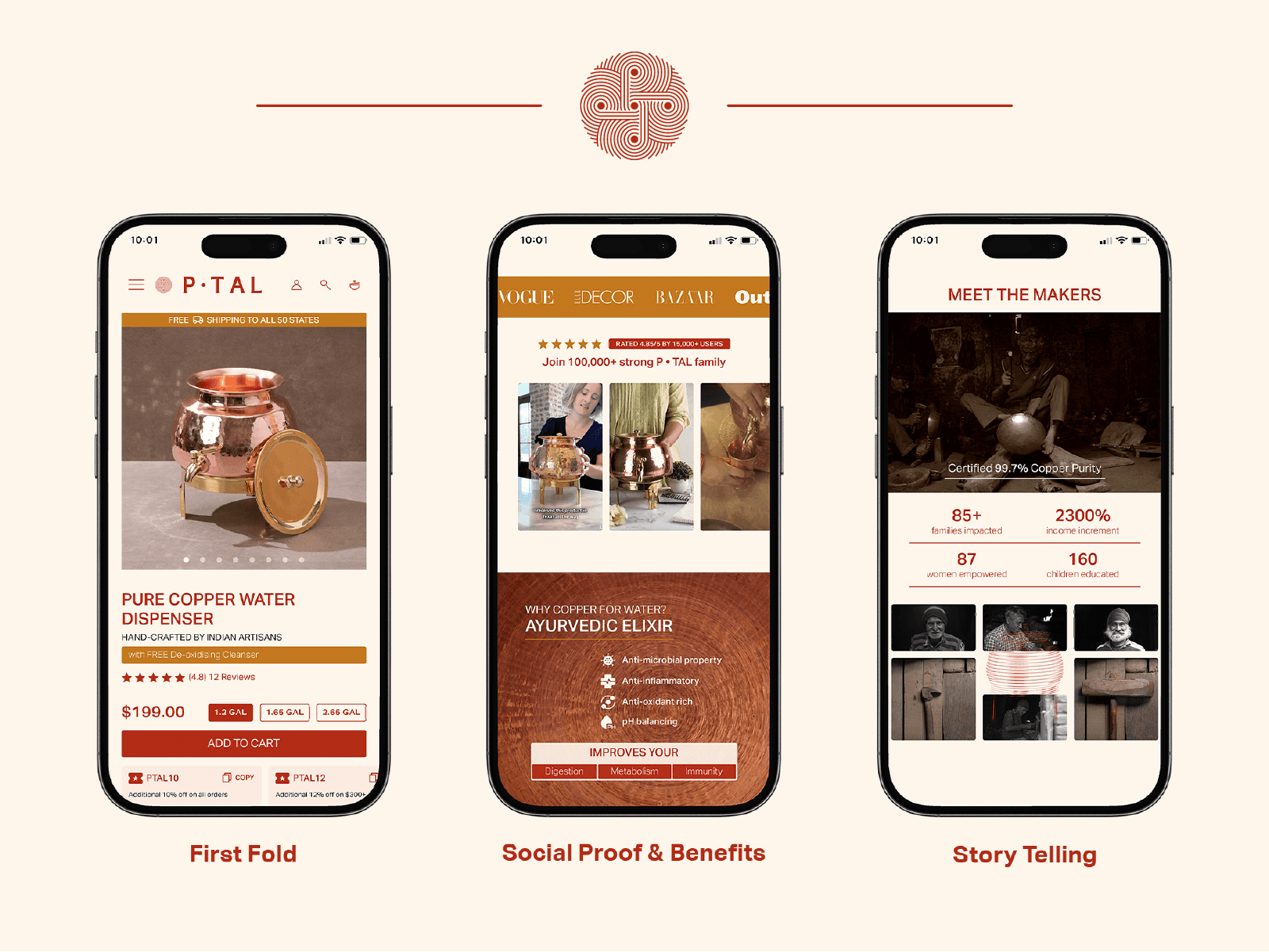
You can explain benefits, features, testimonials, and social proof in a structured way. (Add the review page and the worker story telling page ss)Easy Tracking & Testing
Landing pages are perfect for A/B testing copy, design, or offers → helps optimize continuously.
For me, a landing page should be fast, clear, focused, and beautifully designed.
Cause isn’t a luxury - it’s a growth tool.
As a founder, I’ve learned that a landing page isn’t about fancy design or clever words - it’s about clarity, trust, and focus.
When you truly understand your user and remove every unnecessary distraction, conversions happen naturally. A well-built landing page doesn’t just look good; it quietly does the hard work of growing your business every single day.
If you’re a D2C brand, startup, or founder who needs a landing page that actually performs - Avyaan Design Lab can help.
We combine smart UX, stunning UI, and conversion psychology to build landing pages that actually converts.
Enjoyed the read?
Share it with others
Related
insightful reads

How to design a landing page that converts?

August 10, 2025
SEO TIPS
Design Tips
The question every designer and founder thinks about! And trust me - everyone is still seeking the answer. Because your landing page is your digital salesperson.
Whether you’re launching a new product, running ads, or building your email list, a high-converting landing page can make or break your marketing efforts.
At Avyaan Design Lab, we help brands craft landing pages that not only look great but also drive real results. And after seeing proven outcomes for our clients, here are some tips that helped us achieve high conversions.
What is a landing page?

A landing page is a standalone web page built for a specific goal - usually to convert visitors into leads, customers, or subscribers. Unlike full websites, landing pages remove distractions and focus on one action: buy, book, sign up, or learn more.
2. Why most landing pages don’t convert?
Many brands create landing pages that are visually appealing but fail to convert. Why? Because they:
Talk about themselves too much
Don’t address the user’s pain points
Lack a clear CTA
Load slowly or look bad on mobile
Let’s fix that.
3. Key elements of a high-converting landing page
Clear headline that solves a problem
Use the top of the page to answer: “What is this and why should I care?”✅ Tip: Speak directly to the user’s pain point or desire.
Visual hierarchy that guides the eye
Design isn’t just about aesthetics - it’s about directing attention. Use whitespace, bold CTAs, and contrasting colors to guide visitors exactly where you want them to go.One primary CTA (Call to Action)
Don’t confuse your users with multiple options. One page = one goal = one primary button.
✅ Examples: Book a Call, Try for Free, Get the Sample BoxTrust-Building Elements
Some sections that reduce hesitation and increase credibility amongst new comers:Testimonials
Client logos
Ratings/reviews
Press mentions
Mobile-First & Fast-Loading
53% of visitors bounce if your page takes more than 3 seconds to load.
Make it snappy. Make it mobile. Always.Conversion-Optimized Copy
Use benefit-driven language.❌ Not: “We make protein bars.”
✅ Yes: “Fuel your day with clean energy - without the crash.”Design That Matches Your Brand
Your landing page should reflect your visual identity - colors, fonts, tone. A well-branded page increases trust and recognition.
Bonus: UX Writing Tips
Use short, scannable sentences
Break text into bullets
Replace “Submit” with action words like “Get Started,” “Unlock Access,” “Send Me the Ebook”
Why you need a dedicated Landing Page for your product!

ONE goal → conversion.
Unlike your website homepage (which has too many links and distractions), a landing page is laser-focused!Higher Conversions
Clear CTA, minimal distractions, and tailored messaging!
Result? Help increase sign-ups, purchases, or leads!Ad Performance
If you’re running ads, sending traffic to a generic homepage wastes money. A landing page ensures ad-message match = better ROI.Storytelling & Trust
You can explain benefits, features, testimonials, and social proof in a structured way. (Add the review page and the worker story telling page ss)Easy Tracking & Testing
Landing pages are perfect for A/B testing copy, design, or offers → helps optimize continuously.
For me, a landing page should be fast, clear, focused, and beautifully designed.
Cause isn’t a luxury - it’s a growth tool.
As a founder, I’ve learned that a landing page isn’t about fancy design or clever words - it’s about clarity, trust, and focus.
When you truly understand your user and remove every unnecessary distraction, conversions happen naturally. A well-built landing page doesn’t just look good; it quietly does the hard work of growing your business every single day.
If you’re a D2C brand, startup, or founder who needs a landing page that actually performs - Avyaan Design Lab can help.
We combine smart UX, stunning UI, and conversion psychology to build landing pages that actually converts.
Enjoyed the read?
Share it with others
Related
insightful reads

How to design a landing page that converts?

August 10, 2025
SEO TIPS
Design Tips
The question every designer and founder thinks about! And trust me - everyone is still seeking the answer. Because your landing page is your digital salesperson.
Whether you’re launching a new product, running ads, or building your email list, a high-converting landing page can make or break your marketing efforts.
At Avyaan Design Lab, we help brands craft landing pages that not only look great but also drive real results. And after seeing proven outcomes for our clients, here are some tips that helped us achieve high conversions.
What is a landing page?

A landing page is a standalone web page built for a specific goal - usually to convert visitors into leads, customers, or subscribers. Unlike full websites, landing pages remove distractions and focus on one action: buy, book, sign up, or learn more.
2. Why most landing pages don’t convert?
Many brands create landing pages that are visually appealing but fail to convert. Why? Because they:
Talk about themselves too much
Don’t address the user’s pain points
Lack a clear CTA
Load slowly or look bad on mobile
Let’s fix that.
3. Key elements of a high-converting landing page
Clear headline that solves a problem
Use the top of the page to answer: “What is this and why should I care?”✅ Tip: Speak directly to the user’s pain point or desire.
Visual hierarchy that guides the eye
Design isn’t just about aesthetics - it’s about directing attention. Use whitespace, bold CTAs, and contrasting colors to guide visitors exactly where you want them to go.One primary CTA (Call to Action)
Don’t confuse your users with multiple options. One page = one goal = one primary button.
✅ Examples: Book a Call, Try for Free, Get the Sample BoxTrust-Building Elements
Some sections that reduce hesitation and increase credibility amongst new comers:Testimonials
Client logos
Ratings/reviews
Press mentions
Mobile-First & Fast-Loading
53% of visitors bounce if your page takes more than 3 seconds to load.
Make it snappy. Make it mobile. Always.Conversion-Optimized Copy
Use benefit-driven language.❌ Not: “We make protein bars.”
✅ Yes: “Fuel your day with clean energy - without the crash.”Design That Matches Your Brand
Your landing page should reflect your visual identity - colors, fonts, tone. A well-branded page increases trust and recognition.
Bonus: UX Writing Tips
Use short, scannable sentences
Break text into bullets
Replace “Submit” with action words like “Get Started,” “Unlock Access,” “Send Me the Ebook”
Why you need a dedicated Landing Page for your product!

ONE goal → conversion.
Unlike your website homepage (which has too many links and distractions), a landing page is laser-focused!Higher Conversions
Clear CTA, minimal distractions, and tailored messaging!
Result? Help increase sign-ups, purchases, or leads!Ad Performance
If you’re running ads, sending traffic to a generic homepage wastes money. A landing page ensures ad-message match = better ROI.Storytelling & Trust
You can explain benefits, features, testimonials, and social proof in a structured way. (Add the review page and the worker story telling page ss)Easy Tracking & Testing
Landing pages are perfect for A/B testing copy, design, or offers → helps optimize continuously.
For me, a landing page should be fast, clear, focused, and beautifully designed.
Cause isn’t a luxury - it’s a growth tool.
As a founder, I’ve learned that a landing page isn’t about fancy design or clever words - it’s about clarity, trust, and focus.
When you truly understand your user and remove every unnecessary distraction, conversions happen naturally. A well-built landing page doesn’t just look good; it quietly does the hard work of growing your business every single day.
If you’re a D2C brand, startup, or founder who needs a landing page that actually performs - Avyaan Design Lab can help.
We combine smart UX, stunning UI, and conversion psychology to build landing pages that actually converts.
Enjoyed the read?
Share it with others
Related
insightful reads
feeling lucky yet?
feeling lucky yet?
let’s get started with your brand’s transformative journey
let’s get started with your brand’s transformative journey
menu
let's enjoy some music,
shall we?

The Four Seasons
Antonio Vivaldi

The Four Seasons
Antonio Vivaldi

